In a world consumed by clutter and chaos, a pure white, minimalist home interior brings forth a sense of peace. It’s an aesthetic that celebrates the beauty of simplicity and the grace of clean lines, where every item has a purpose and place. This minimalist home concept, visualized by 0429 design, stands apart from the rest with rhythmic repetitions of symmetry and alignment, which cements an atmosphere of enduring serenity and balance. Here, we will explore the essence of refined minimalist design, including how to use concise duplication, perfect linearity, and diffused light to create an oasis of calm in a hectic existence.
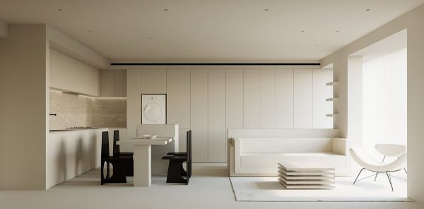
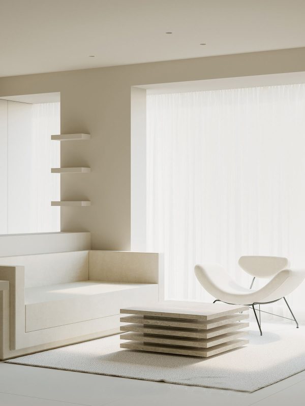
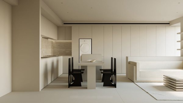
In the open-plan living space, an overarching white decor theme consumes every aspect and silhouette. A white area rug subtly defines the lounge area with soft texture.
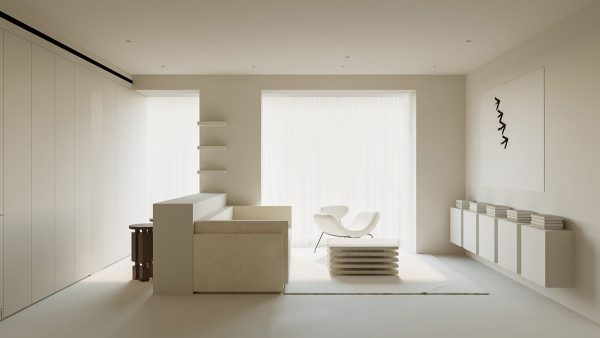
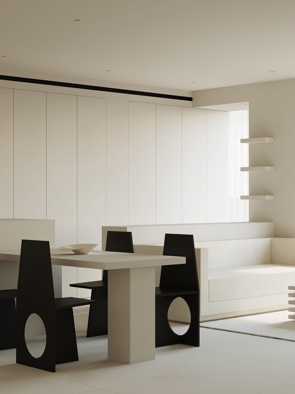
The back of the minimalist living room is lined with built-in storage units, which hide away every single piece of visual clutter. The result is a soothing, laconic setting that brings peace of mind.
A layered, modern coffee table design stacks visual interest at the center of the room, creating a solid focal point. A contemporary white lounge chair carves a curvaceous outline in front of a floor-to-ceiling window. Sheer white voiles diffuse the flow of sunlight, causing it to fall more softly over the all-white decor scheme.
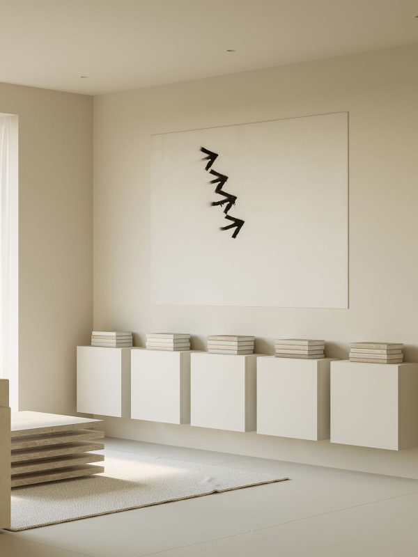
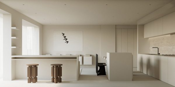
Minimalist wall art makes a monochrome statement above a rhythmic row of wall-hung units. Repetitious book stacks are laid on top, each echoing the layered coffee table design.
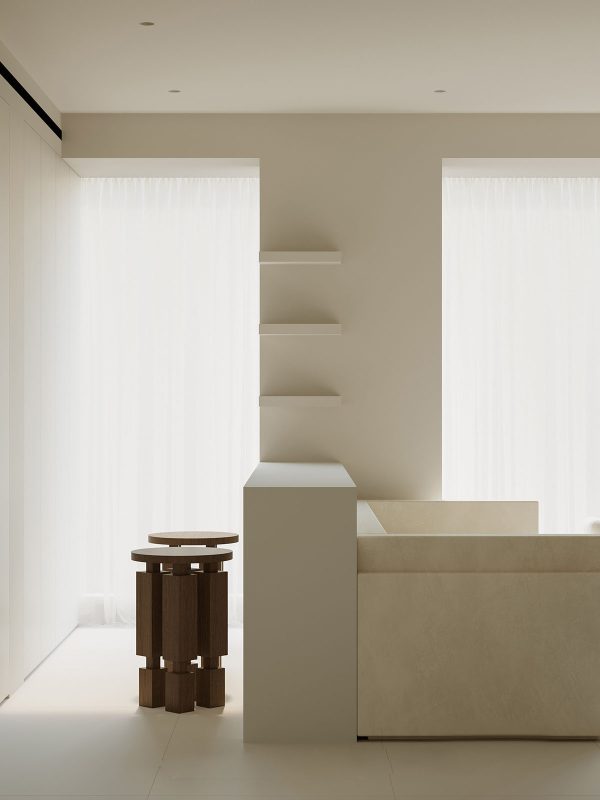
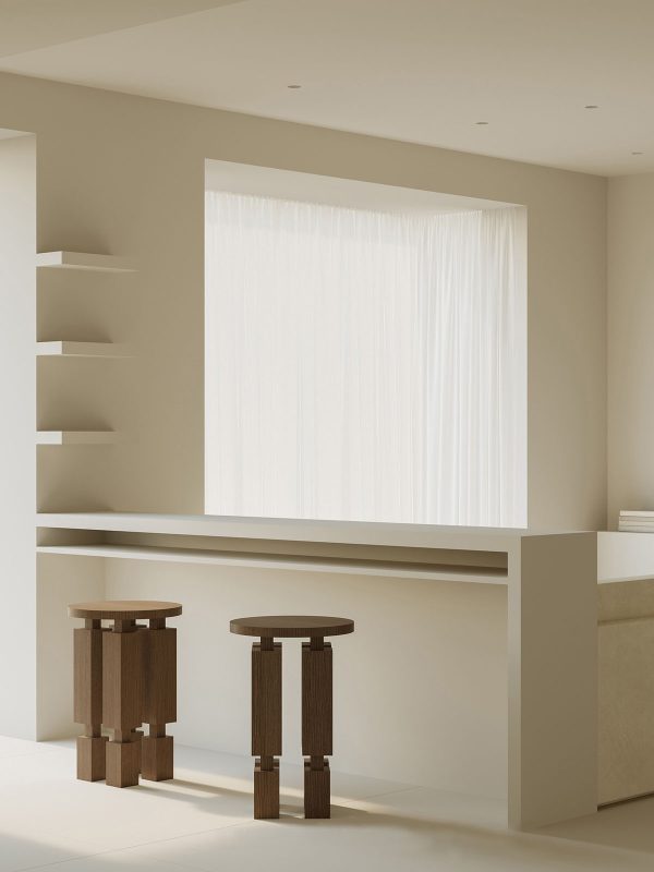
A boxy white sofa backs onto a small peninsula, which serves as a multifunctional bar for casual dining, drinks, or working. Floating shelves climb the wall beside it, creating display space for precious objects or plants.
Two unique wooden bar stools boldly contrast the plain white bar, creating a sculptural element in the gallery white space. A long shelf is installed underneath the peninsula worktop so that laptops and papers can easily be tucked away after working from home.
Each element of the minimalist living space is methodically aligned, creating a perfectly ordered aesthetic.
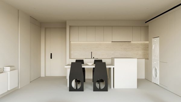
The storage units at the back of the living room dining room combo also encompass a utility area with a stacked washing machine and dryer.
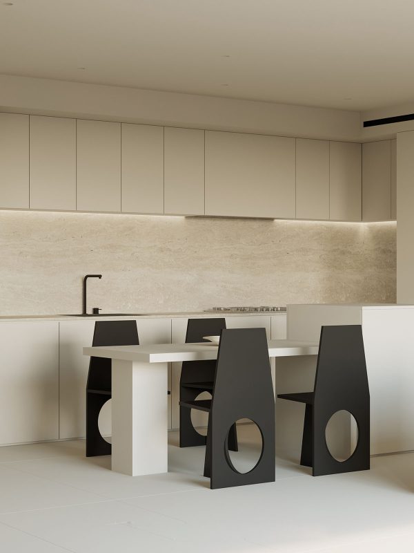
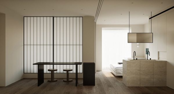
The dining table stands right up alongside the kitchen island to create a linear, single flow of furniture. Warm white kitchen cabinets and a travertine backsplash smooth quietly alongside them.
A unique fruit bowl makes an elegant and functional dining table centerpiece.
Four modern black dining chairs make a stark contrast with the warm white surroundings. A black kitchen faucet and sink repeat the black accent.
The door that leads off the living room gives entry to a peaceful study area.
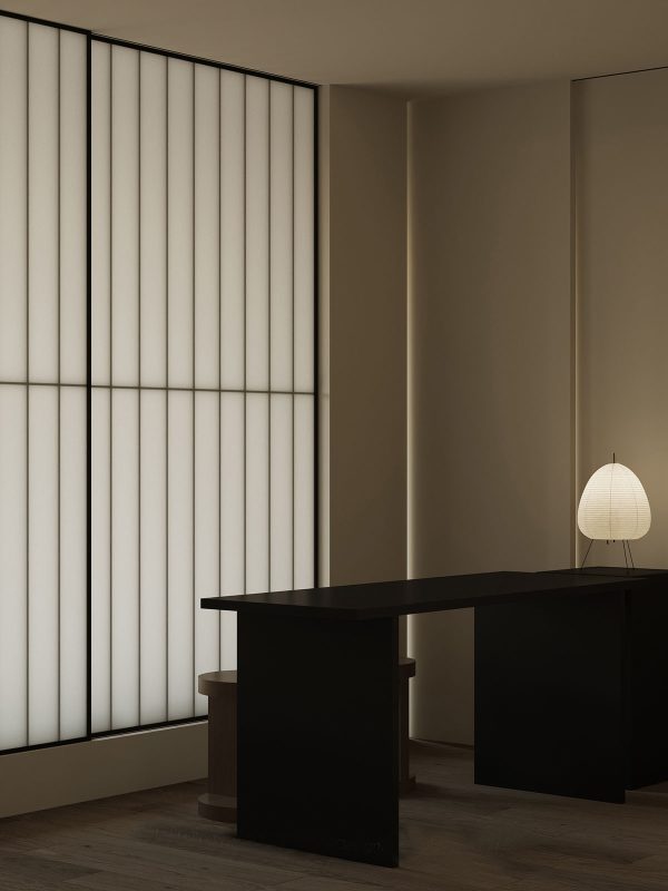
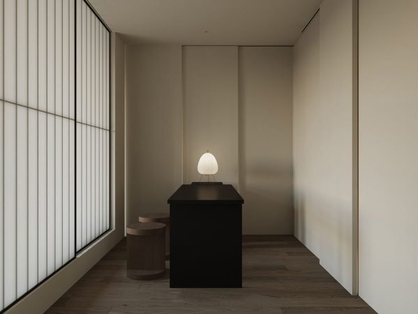
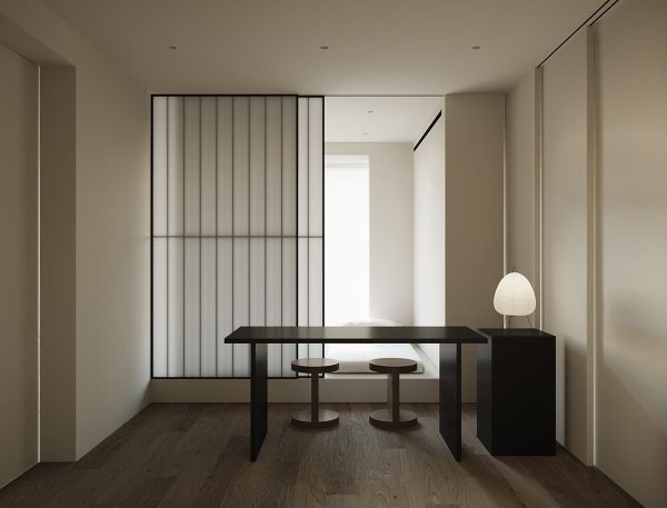
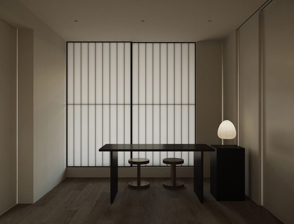
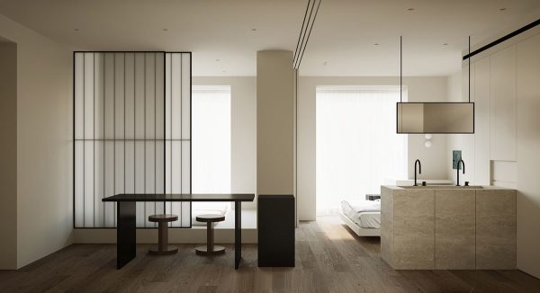
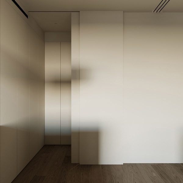
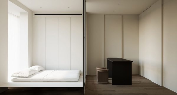
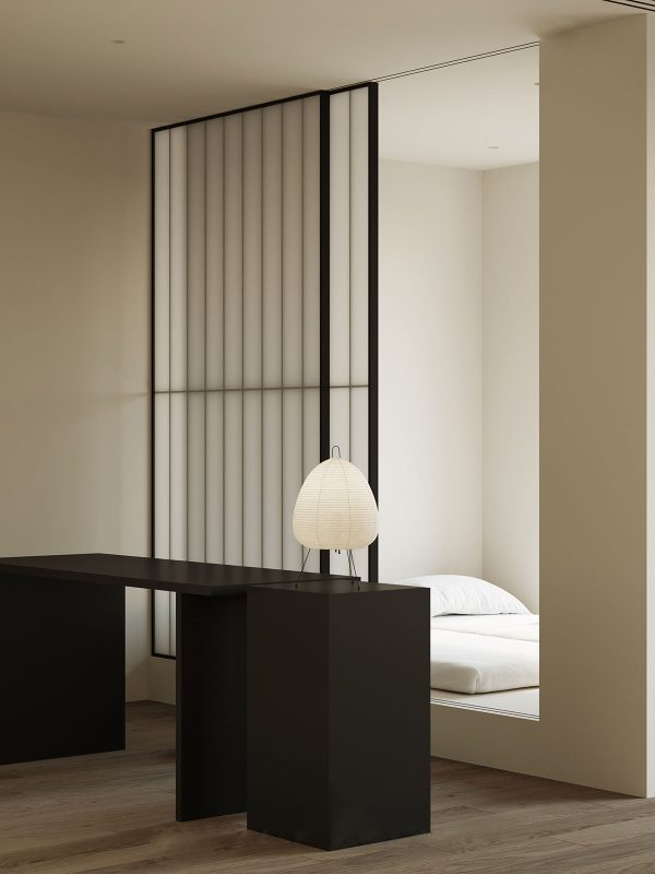
A shoji screen closes behind the double workspace. A set of solid white sliding doors are camouflaged with the walls at the side of the desk.
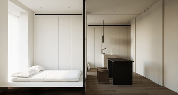
Each set of sliding doors conceals a private bedroom.
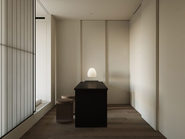
With the bedroom doors opened up during the daytime, the adjoining study area receives more natural light.
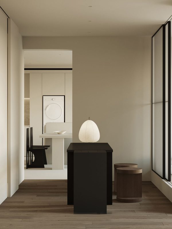
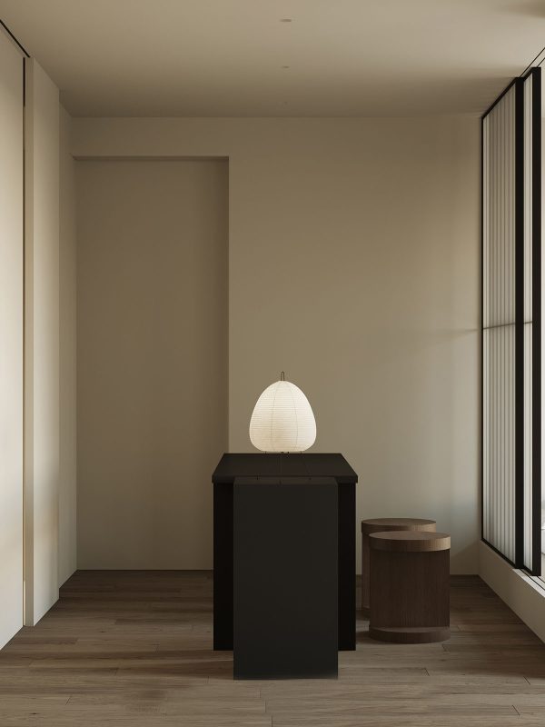
A small side table hosts a paper table lamp for evening illumination.
Two small stools and a minimalist desk design keep the furniture layout simple and uniform.
The door to the living room is frameless and handle-free, which leaves the minimalist workspace looking uncluttered. Walls are devoid of art and knickknacks. Removing all visual distractions makes the workspace more conducive for focused tasks.
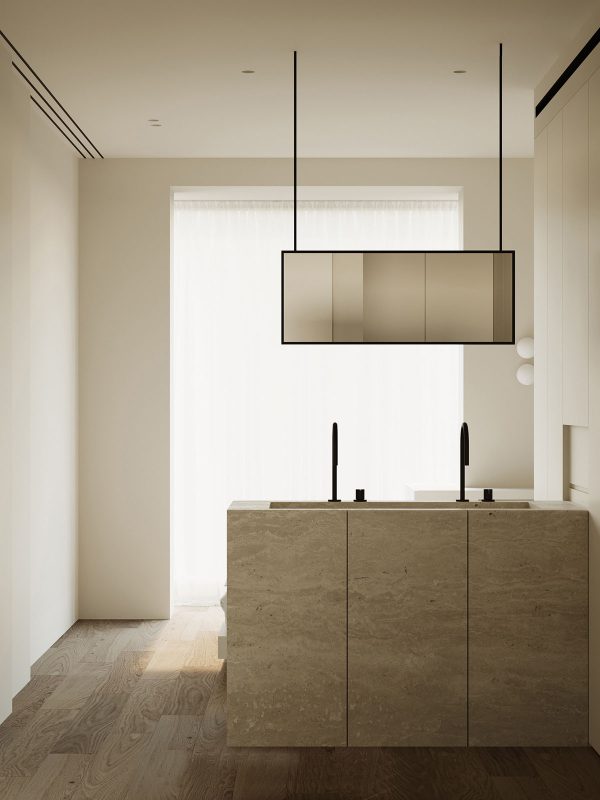
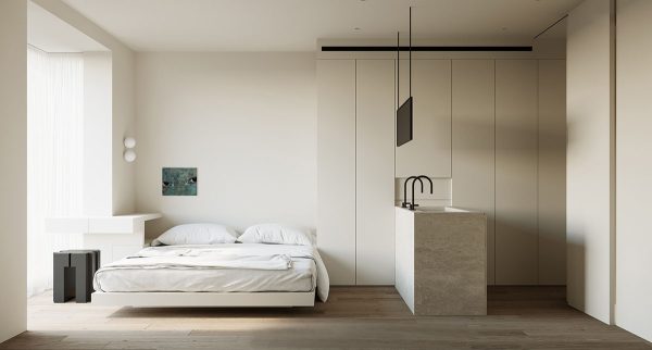
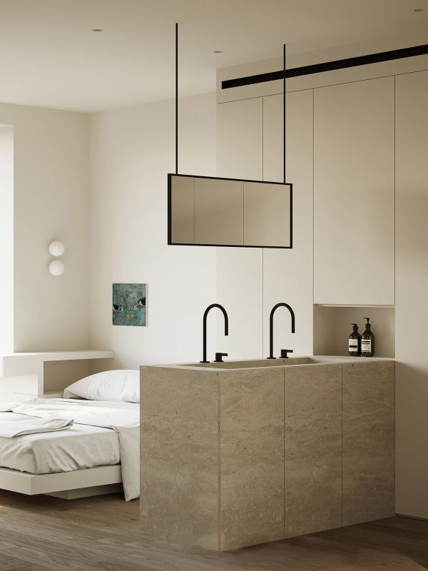
The solid white sliding doors draw back to reveal the master suite. It has an open-plan ensuite bathroom area with a crisp, linear double vanity unit.
The vanity unit and a ceiling-mounted mirror fashion a division between the ensuite and sleep space.
A secretive sliding door provides access to the master closet.
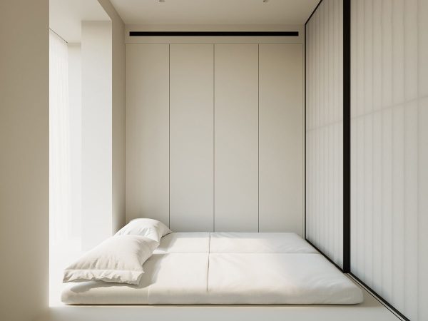
Behind the shoji screen, there is a built-in platform bed with two single mattresses for the kids. A wall of neat white wardrobes houses all of their clothes, games, and books.
A large window wakes the second bedroom inhabitants with the sunrise.
The perpendicular sliding doors allow this space to be continually reconfigured, adjoining the workspace to either the master bedroom or the secondary sleep space. With both sets of doors open, the adjoined layout becomes a busy family unit where the children can be helped with homework or assisted in dressing for school in the mornings.
With either set of doors drawn shut, you wouldn’t know the adjoining room was even there. The solid doors give the master bedroom the utmost privacy.
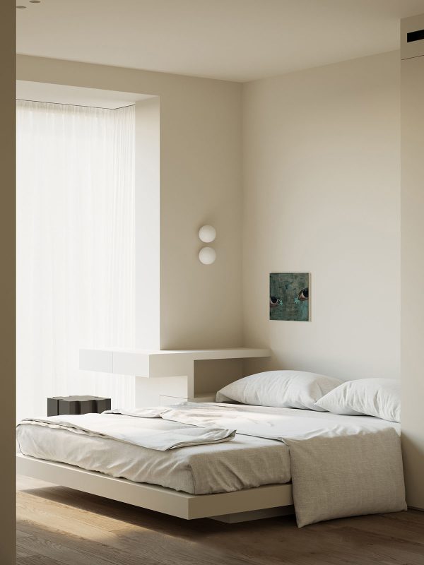
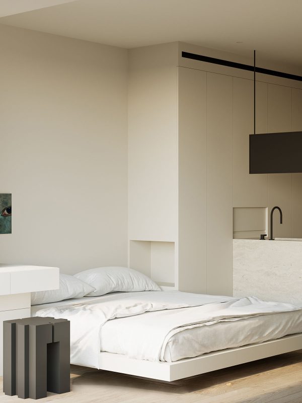
Inside the master bedroom, a bespoke nightstand-desk combo is configured around an awkwardly shaped perimeter. Two modern wall sconces illuminate the piece. White voiles hang at the window to soften direct sunlight.
The second nightstand is recessed inside a wall of storage to save space around the bed.
Wood flooring runs throughout the two bedrooms and their adjoining workspace to achieve tranquil cohesivity.
Storage cabinets build a defining wall alongside the master ensuite.
A toiletries shelf is inserted into the wall of storage units, to keep the bathroom countertop clutter-free. A small, white shutter pulls down to cover the nook when it’s not in use.
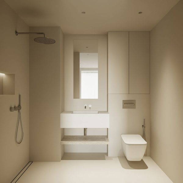
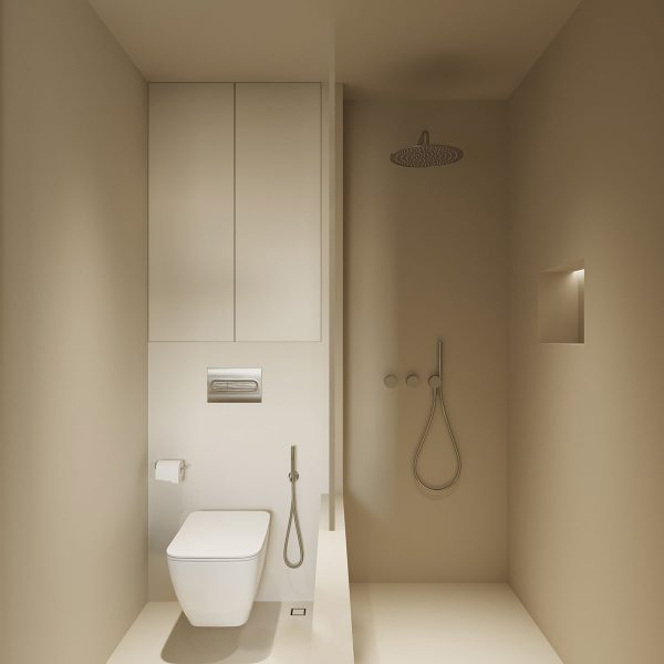
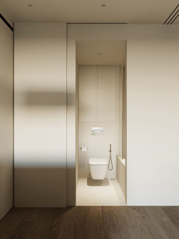
A master shower room is privately closed off from the open plan arrangement. A wall-mounted toilet and bathroom sink keep the floor clear and spacious. Storage is hidden inside the toilet cistern concealment wall.
There is also a smaller bathroom with a built-in tub for the kids.
The kids’ bathroom is hidden behind a sliding door that stands opposite the desk.
Recommended Reading: White Minimalism: 3 Examples That Show How To Get It Right
For more regular updates from Home Designing, join us on Facebook.

If you are reading this through e-mail, please consider forwarding this mail to a few of your friends who are into interior design. Come on, you know who they are!
Related Posts:
 51 Modern Houses That Impress With Stunning Architecture, Pools & Landscaping
 Neutral, Modern-Minimalist Interior Design: 4 Examples That Masterfully Show Us How
 Interior Design, Simplicity, And Self Exploration
 Mid-Century Modern Classic Chairs
Belum ada tanggapan untuk "Minimalist Home With Satisfying Symmetry Alignment and Grace"
Post a Comment
Please drop a word here...
Note: only a member of this blog may post a comment.